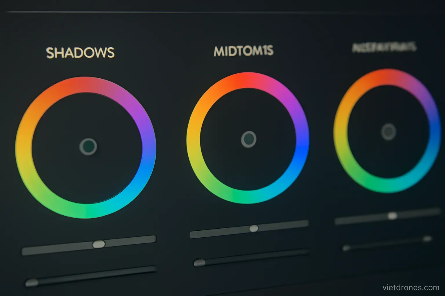
Grading is two jobs that get confused with each other. The first is making every clip look correct and consistent. The second is giving the piece a look. Doing them in the wrong order creates most grading problems.
Correction before grading
Balance every clip first. Exposure, contrast and white balance brought to a neutral, correct starting point.
Use scopes rather than eyes. Visual perception adapts within a minute and stops being reliable.
Set black and white points. Ensure the darkest and brightest parts sit in a sensible range.
Fix colour casts. Neutral surfaces such as concrete and cloud should appear neutral.
Match clip to clip. Adjacent shots of the same scene must agree before any look is applied.
Work from a reference clip. Choose the best-exposed shot and bring the others towards it.
Do not grade in isolation. Judge every clip against its neighbours in the timeline.
Keep corrections modest. Heavy correction reveals compression and noise, especially in eight-bit footage.
Save a corrected version. Keeping the neutral grade separately means a different creative look can be tried later without redoing the correction work.
Only then apply a look. The creative layer sits on top of correct footage, never instead of it.
Handling skies
Skies band easily. Large smooth gradients show stepping when contrast or saturation is pushed.
Ten-bit footage bands far less. If your drone offers it, this is the main practical reason to use it.
Add a touch of noise if banding appears. A small amount of grain masks the steps effectively.
Do not oversaturate blue. Deep artificial blue is one of the clearest amateur signatures.
Recover highlights carefully. Pulling back a blown sky produces grey mush rather than detail.
Use masks for sky-only adjustment. Separating sky from ground allows each to be treated properly.
Keep the horizon transition clean. Visible mask edges along a horizon are very noticeable.
Match skies across clips. Different sky colour between adjacent shots is jarring.
Accept the limit. A featureless white overcast sky cannot be graded into an interesting one.
Water, vegetation and land
Water carries the mood. Small shifts in its colour change the perceived time of day and weather.
Avoid unnatural turquoise. Overworked water is as recognisable as an oversaturated sky.
Vegetation goes wrong quickly. Greens turn artificial with very little saturation increase.
Shift green hue rather than saturation. Small hue adjustments look far more natural.
Watch skin tones. If people appear, their colour anchors the viewer's judgement of everything else.
Sand and rock take warmth well. They tolerate more adjustment than vegetation does.
Use dehaze sparingly. It adds contrast and noise together, and it looks harsh when pushed.
Consider adding atmosphere. Slight haze in distant layers can improve depth rather than reduce it.
Grade for the subject. The look should serve the place, not overwrite it.
Using LUTs
A LUT is a starting point. Not a finished grade, and never a substitute for correction.
Correct before applying. A LUT applied to uncorrected footage amplifies whatever was wrong.
Match the LUT to the profile. A LUT built for one camera profile will misbehave on another.
Reduce the intensity. Most LUTs look better at half strength.
Adjust after applying. Exposure and saturation almost always need retouching afterwards.
Check highlights and shadows. LUTs frequently clip one or both.
Use one LUT per project. Different looks between shots destroy the sense of one place.
Build your own over time. Saving a grade you like as a starting point speeds up future work.
Or skip them entirely. A careful manual grade beats a preset in almost every case.
Avoiding the common excesses
Oversaturation. The most frequent fault, and it reads as inexperience immediately.
Crushed blacks. Losing all shadow detail for contrast looks harsh on aerial subjects.
Heavy teal and orange. A strong look that suits some material and dates all of it.
Excessive sharpening. It creates halos, especially along horizons and rooflines.
Overuse of vignettes. They draw attention to themselves in wide aerial frames.
Grading on an uncalibrated bright screen. The result looks dark and muddy everywhere else.
Grading late at night. Tired eyes consistently push saturation and contrast too far.
Not checking on other devices. Phone, laptop and television differ substantially.
Stopping too late. If you are unsure whether it is too much, it is.
Frequently asked questions
What is the correct order for grading?
Correction first — exposure, contrast, white balance and clip matching — and only then a creative look applied on top of already correct footage.
Why do skies band when graded?
Because large smooth gradients show stepping when contrast or saturation is pushed, especially in eight-bit footage. Adding slight grain masks it.
How should I adjust greens?
Shift the hue slightly rather than raising saturation. Vegetation turns artificial with very little saturation increase and it is immediately noticeable.
Are LUTs worth using?
As a starting point, applied at reduced strength to already corrected footage and adjusted afterwards. A careful manual grade usually beats a preset.
More in Care and repair and Batteries and accessories.